Phison Blog Redesign
A 10-week UX/UI internship project turning Phison Electronics' corporate blog into a clear, browsable hub — for engineers hunting technical specs and marketers assessing brand credibility alike.
Phison's blog had no clear purpose, categories, or page navigation, and four stakeholders each wanted something different from it.
Benchmarked 5 competitor blogs, interviewed 4 stakeholders, built 2 personas, and tested two rounds of prototypes.
A full redesign system (homepage, category, article, and search templates) handed off to Phison's Marketing and Web teams.
- 0weeks, research to handoff
- 0competitor blogs benchmarked
- 0stakeholders interviewed
- 0prototype rounds, user-tested
The problem
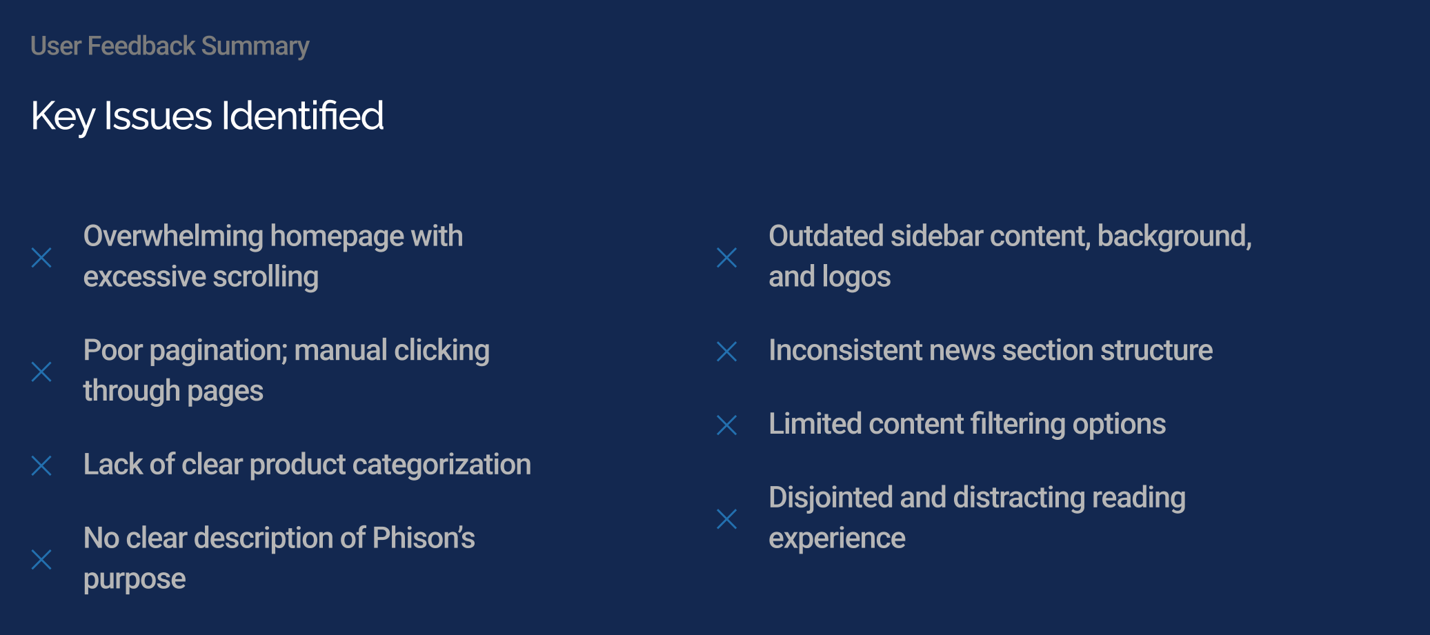
Phison Electronics — a storage and AI-hardware company — had let its blog grow into an unstructured content dump: an overwhelming homepage with excessive scrolling, no consistent product categorization, pagination that had to be clicked through manually with no jump-to-page, and, in the President's own words during our first interview, no clear description of what the blog was even for. Four stakeholders across Product Marketing, Creative, Corporate Marketing, and the executive team each had a different read on what the blog should prioritize, and usability testing surfaced the same pain points from both a technical reader and a brand-evaluating partner: the site was hard to scan, hard to search, and didn't read as credible. My job for the summer was to turn that into one coherent redesign, with a working prototype and design recommendations handed to the Marketing and Web teams by the end of week 10.
Research & interviews
I opened with a formal research plan, broken into three phases: a competitive analysis to benchmark the industry, a usability review of Phison's own blog, and a user feedback loop to validate whatever I proposed before it shipped. For the competitive analysis I ran a functional teardown of five peer storage-company blogs — Western Digital, Micron, Solidigm, Seagate, and Samsung — scoring each against a rubric of homepage hierarchy, article-card design, search/filter functionality, and navigation clarity. Western Digital's clear content hierarchy and featured-article banner scored highest (8.5/10); Solidigm's flat, static layout scored lowest (5/10). That teardown became a short list of best practices to design toward: a featured-article hero, purposeful article-card metadata (summary, date, read time, tags), and related-content discovery.
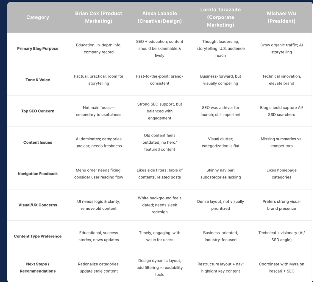
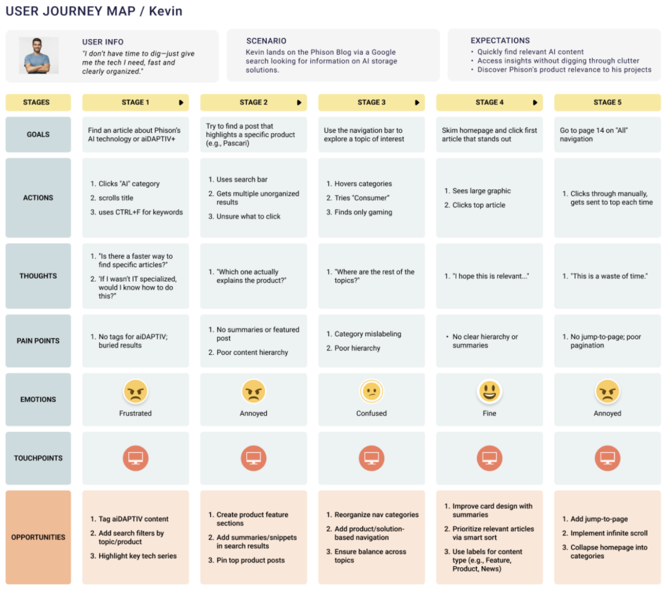
In week 2, I interviewed four stakeholders — the President, and leads from Product Marketing, Creative/Design, and Corporate Marketing — to reconcile their differing priorities into one direction. Independently, all four flagged the same three things: content felt stale, categorization was unclear, and the page needed real visual hierarchy. I presented progress at these check-ins weekly for the rest of the project, so nothing shipped that hadn't already been reacted to by the people who'd actually judge it. From there I built two personas to represent the blog's two real audiences: Kevin, a time-pressured ML engineer who wants technical content fast with no digging, and Sophia, a product marketing director evaluating whether the blog reflects enough brand credibility to recommend a partnership. Mapping both of their journeys through the existing site, the pattern held: sentiment slid from curious to annoyed by the third stage, and both personas hit the same wall — no pagination control and no way to jump to what they actually needed.
Methodology
Each stakeholder interview ran about 30 minutes: a quick context conversation about their role and priorities, a think-aloud walkthrough of the existing blog, and a short wrap-up on what they'd change first if they could only pick one thing. Usability sessions with test users later in the project followed the same shape, swapping "priorities" for a couple of realistic tasks — find a specific product category, judge whether a post looked credible enough to share with a partner.
Constraints
This was a solo internship project on a 10-week clock, so the sample was small by design: four internal stakeholders and, later, three usability testers, all reachable through the company rather than recruited externally. That was enough to catch the big, obvious problems everyone agreed on — but it means this case study speaks more confidently to internal alignment than to whether an external engineer or partner, encountering the blog cold, would react the same way.
How the ten weeks actually ran
-
Weeks 1–2
Benchmark and listen
Scored five competitor blogs against a UX rubric, then interviewed the President and three marketing leads. All four independently named the same three problems.
-
Weeks 3–4
Define who this is for
Built Kevin (ML engineer, no time) and Sophia (marketing director, judging credibility), then mapped both journeys through the existing site to find where sentiment dropped.
-
Weeks 5–6
Sketch → lo-fi → mid-fi
Three wireframe passes, each one shown at the weekly stakeholder check-in so nothing got far without a reaction from the people who'd judge it.
-
Weeks 7–8
Prototype 1.0 + usability testing
Moderated sessions with three test users. Feedback clustered into navigation & interactivity, visual polish, and clearer microinteractions.
-
Weeks 9–10
Prototype 2.0 + handoff
Folded testing feedback in, extended the system to category, article and search templates, and presented final recommendations to the Marketing and Web teams.
From sketch to prototype
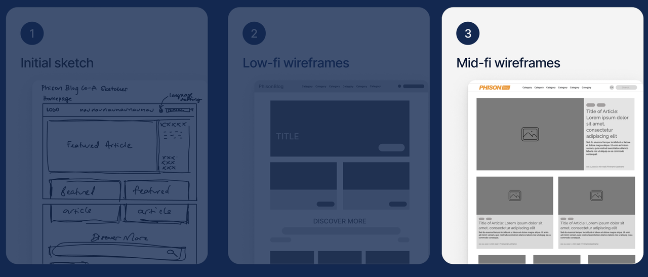
Wireframing moved in three passes: a hand-sketched homepage layout, a low-fi digital wireframe to lock the grid, then a mid-fi wireframe with real content structure — featured hero, tagged article cards, image placeholders — that stakeholders could react to concretely instead of imagining. I built Prototype 1.0 from those wireframes and ran moderated usability sessions with three test users, who converged on three fix categories: navigation & interactivity, visual design polish, and clearer microinteractions — while staying positive on the overall direction.
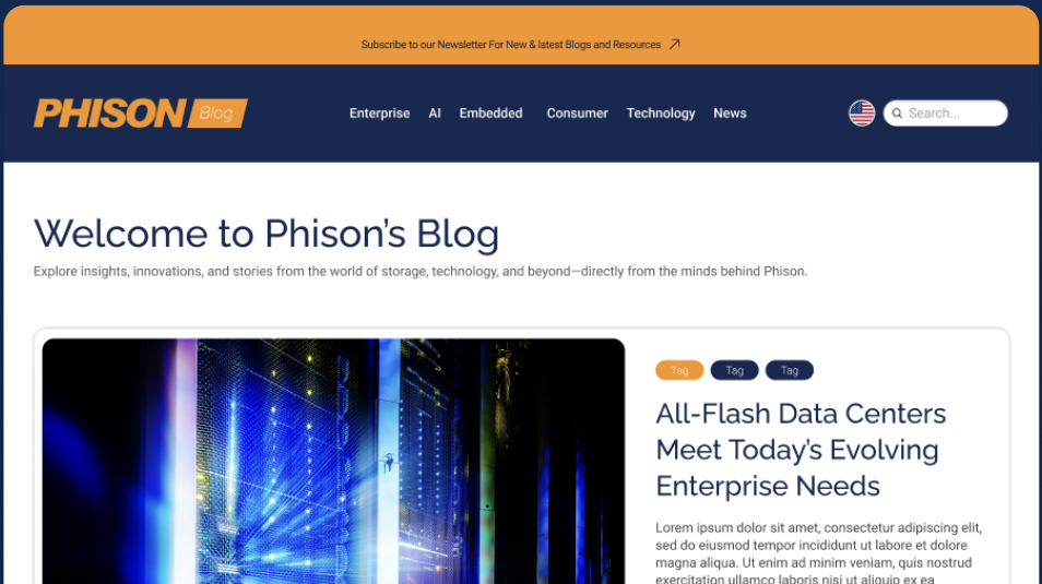
Prototype 2.0 folded that feedback in: a featured-article carousel up top, a consistent card system with tags, date, and read time across every section, a "Welcome to Phison's Blog" intro instead of dropping straight into content, and a newsletter subscribe bar. The system carried past the homepage too — matching templates for category pages, full article pages with related-content and related-product modules, and search results, so the redesign held together as a full site rather than one polished landing page. Set side-by-side with the original, it's the difference between a page you scroll past and a page you can actually use.
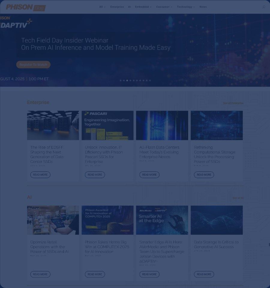
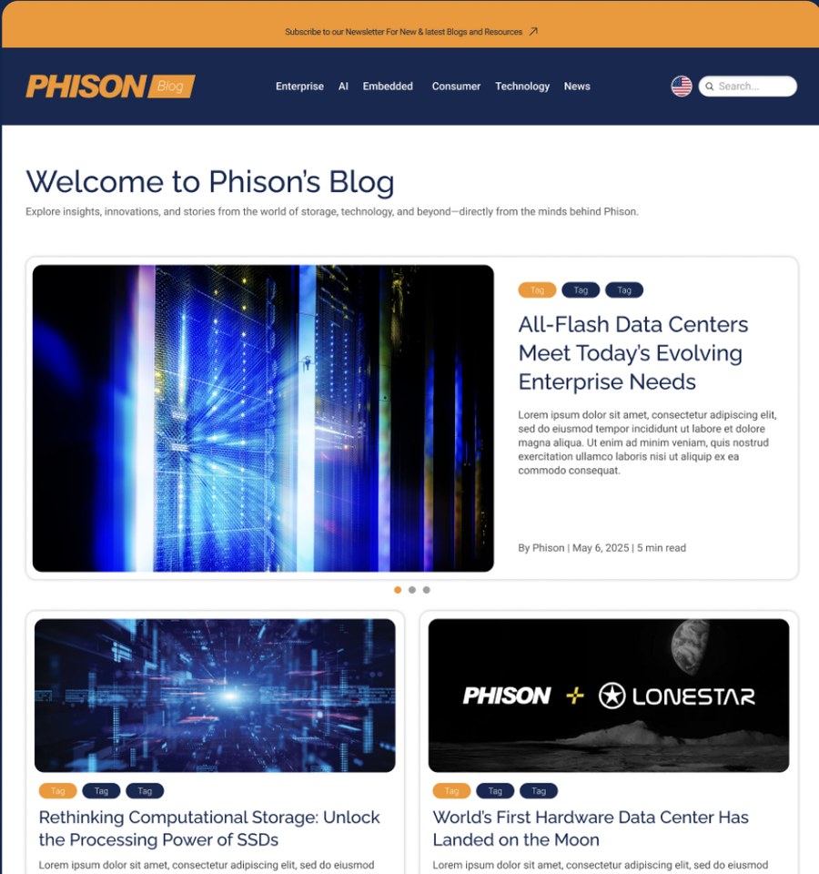
Click and drag anywhere on the image to compare the original homepage with Prototype 2.0.
What actually changed, and why
Tap a marker to read the reasoning behind each decision.

Four decisions
Select a numbered marker above to see what changed and the research behind it.
Outcome & learnings
The project wrapped with a final interactive prototype and a set of design recommendations presented to Phison's Marketing and Web teams at the end of week 10. The harder skill here wasn't the UI work — it was reconciling four stakeholders who each wanted the blog to do something slightly different (SEO reach, brand credibility, technical depth, a more modern look) into one design that didn't quietly favor whoever I'd spoken to most recently. Going back to the persona journey maps whenever a decision started to feel political, instead of relying on whoever argued loudest, is the habit I'd carry into the next project.
What I'd Do Next
If I got more time on this project, external validation is what I'd prioritize first. Every stakeholder and every test user I talked to worked at Phison — enough to catch the obvious structural problems, but not enough to know whether an engineer who's never heard of the company would trust the redesigned blog the way Sophia's persona needed it to.
I'd also want to move past sentiment and into numbers. Testing told me the card system and featured hero were well received, but I never got to see whether that translated into people actually reading more, versus just saying it looked cleaner in a moderated session. Real analytics after launch, or even a simple A/B test on the card metadata, would tell me if the fix actually worked instead of just feeling right in the room.
And with only three usability testers, I'd want a bigger, less internally-recruited sample before calling any of this validated — three people converging on the same three problems is a good signal, not proof.