Carolina Cupboard
A mobile app for a student-run campus food pantry, designed with App Team Carolina to replace paper notecards and guesswork with a system built for volunteers and patrons alike.
UNC's student-run food pantry tracked shifts, stock, and patron visits on paper notecards that nobody could use later.
Mapped a shift lead's and a patron's journeys, then designed role-based inventory and check-in flows with App Team Carolina.
A prototype that replaces the notecards, plus an insights dashboard for organizers. Not shipped yet.
- 0personas, built from real shifts
- 0role-based flows in one app
- 0shelf categories mirrored in-app
- 0paper notecards required
The problem
Carolina Cupboard is a UNC Chapel Hill student-run food pantry, and before this app, running a shift meant paper. Volunteers checked stock and expiration dates by eye and logged them on a notepad; patrons signed in by writing their name and student ID on a notecard. Neither side of that exchange was tracked anywhere the pantry could actually use — no record of who'd visited, what was running low, or what was about to expire. App Team Carolina set out to replace that paper process with a mobile app: one flow for volunteers running inventory and shifts, and one for patrons checking in and out.
Personas & user journeys
We designed around the two people actually standing in the pantry: Emily, a third-year computer science student in her first semester as a shift leader, volunteering between classes because it gives her a sense of purpose in the community; and Zach, a UNC graduate student studying psychology who, despite a merit scholarship, still relies on the pantry's food and toiletries to get through the week. Mapping Emily's shift end to end — clearing expired stock, restocking with soon-to-expire items pulled to the front, hand-logging counts on a notepad — made the busywork impossible to ignore. Mapping Zach's visit — walk in, get handed a paper survey, write his name and PID on a notecard, browse the shelves, leave — showed exactly where the friction was for the person the pantry exists to help: right at the door, before he'd even reached the shelves.
A shift before the app
Emily's journey map, step by step. Every one of these was tracked on paper or not at all — which is the whole argument for building the thing.
-
Step 01
Sign in on paper
Emily walks over from her COMP 110 class and signs in for her shift on a paper sheet.
-
Step 02
Pull expired stock by eye
At the start of every day she checks the shelves for expired items and removes them — no list, no alert, just looking.
-
Step 03
Sort and shelve new items
New donations get sorted, placed on the matching shelf, and rotated so whatever expires soonest sits at the front.
-
Step 04
Hand-write every expiration date
She writes the expiration date on top of each new item so the next volunteer can read it off the packaging.
-
Step 05
Track counts on a notepad
Stock levels and expiration dates get checked frequently and logged on a notepad that lives only in the pantry.
-
Step 06
Note what got done, go home
At the end of the shift she writes up what she accomplished — a handover that the next person may or may not ever see.
Two flows, one system
The final prototype split into role-based menus — a Shift Lead view for inventory and a standard view for browsing — with categories that mirrored how the pantry is actually shelved: Produce, Canned, Dairy, Frozen, Dry Goods, Baked Goods, Beverages, Miscellaneous. Expiring and new-product screens replaced Emily's notepad with a structured log, and check-in/check-out flows replaced Zach's notecard with a real record — down to the confirmation states and loading transitions between steps. An Insights dashboard rolled all of it up for the pantry's organizers: visits by day and inventory by category, at a glance, for the first time.
What each decision is doing
Tap a marker on the Home screen to see what it replaced.
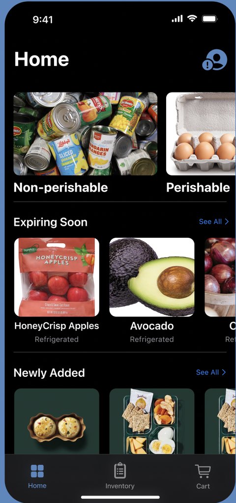
Four decisions
Select a numbered marker to see what it replaced in the paper process.
The rest of the flow
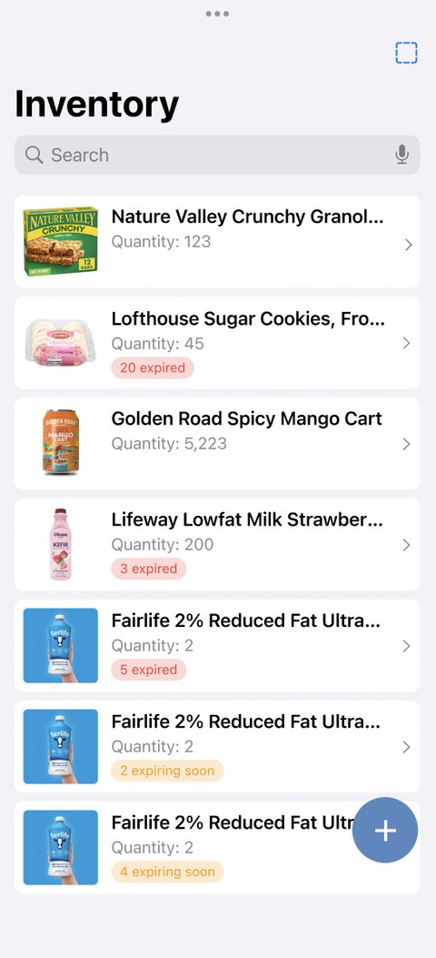
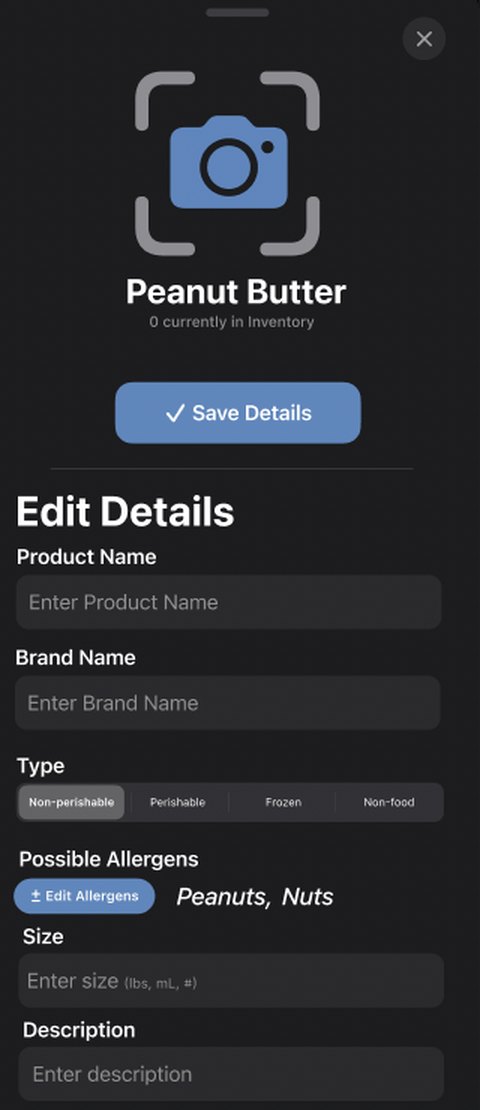
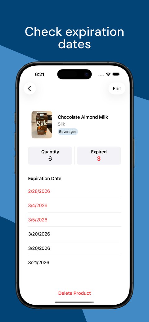
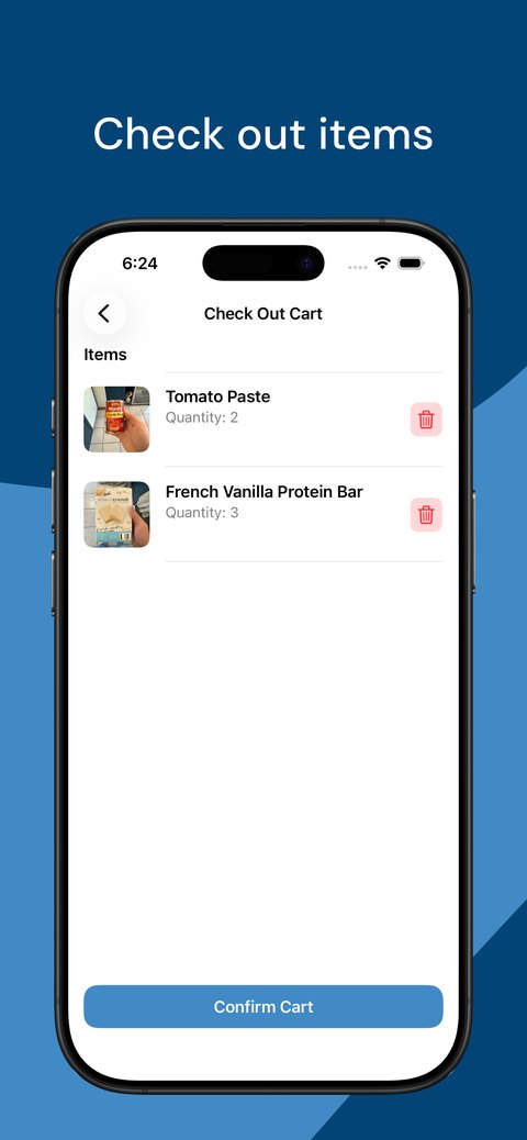
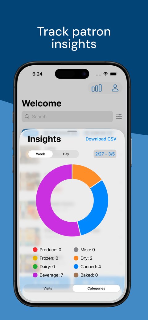
Design decisions went through the same back-and-forth as any team product — reviewed and challenged in comments before anything moved to "Approved," including edge cases I hadn't originally scoped: what happens when the barcode scanner fails, how "low stock" gets defined, whether patrons should be able to reset a password without knowing the old one. Working those into the flows was as much a part of the design as the screens themselves.
Constraints
This was a team project through App Team Carolina, built alongside iOS engineers, web developers, and product managers over more than a year of volunteer availability rather than a fixed client timeline. That gave the design room for real critique and iteration, but it also means none of this has shipped to the pantry's actual volunteers and patrons yet — every decision here is validated by client interviews and internal design review, not by watching it survive a real shift.
Outcome & learnings
This one taught me a different lesson than a corporate internship does: designing for two users with almost nothing in common — a busy CS student running a shift, and a food-insecure grad student just trying to get through checkout with dignity — meant the "efficient" answer for Emily and the "quick and unembarrassing" answer for Zach weren't always the same screen. The times I got it right were the times I designed the check-out flow around Zach's five minutes in the building, not around what would look cleanest in the admin dashboard.
What I'd Do Next
If this shipped tomorrow, the first thing I'd want to test is the actual shift, not just the flow. Every decision here — the Perishable/Non-perishable split, Expiring Soon surfaced on the home screen — was validated in critique and client interviews, but none of it has survived a real Tuesday-afternoon shift with a volunteer who's also trying to help a patron at the same time.
I'd also want to close the loop on the edge cases we scoped mid-project: what actually happens when the barcode scanner fails, or when a patron needs to reset a password without an email on file. Those got worked into the flows, but they're the kind of thing that only really gets tested once real people hit them by accident.
And I'd want Zach's side tested separately from Emily's. It's easy to validate a shift-lead flow with other student designers who think like Emily; it's harder to get a patron's honest reaction to the check-in screen when what you're really testing is whether it feels quick and unembarrassing — and that's the half of this app I trust the least right now.